

dithering and trapping — and other new Spectrolite things!
and a behind the scenes look at a few prints in progress
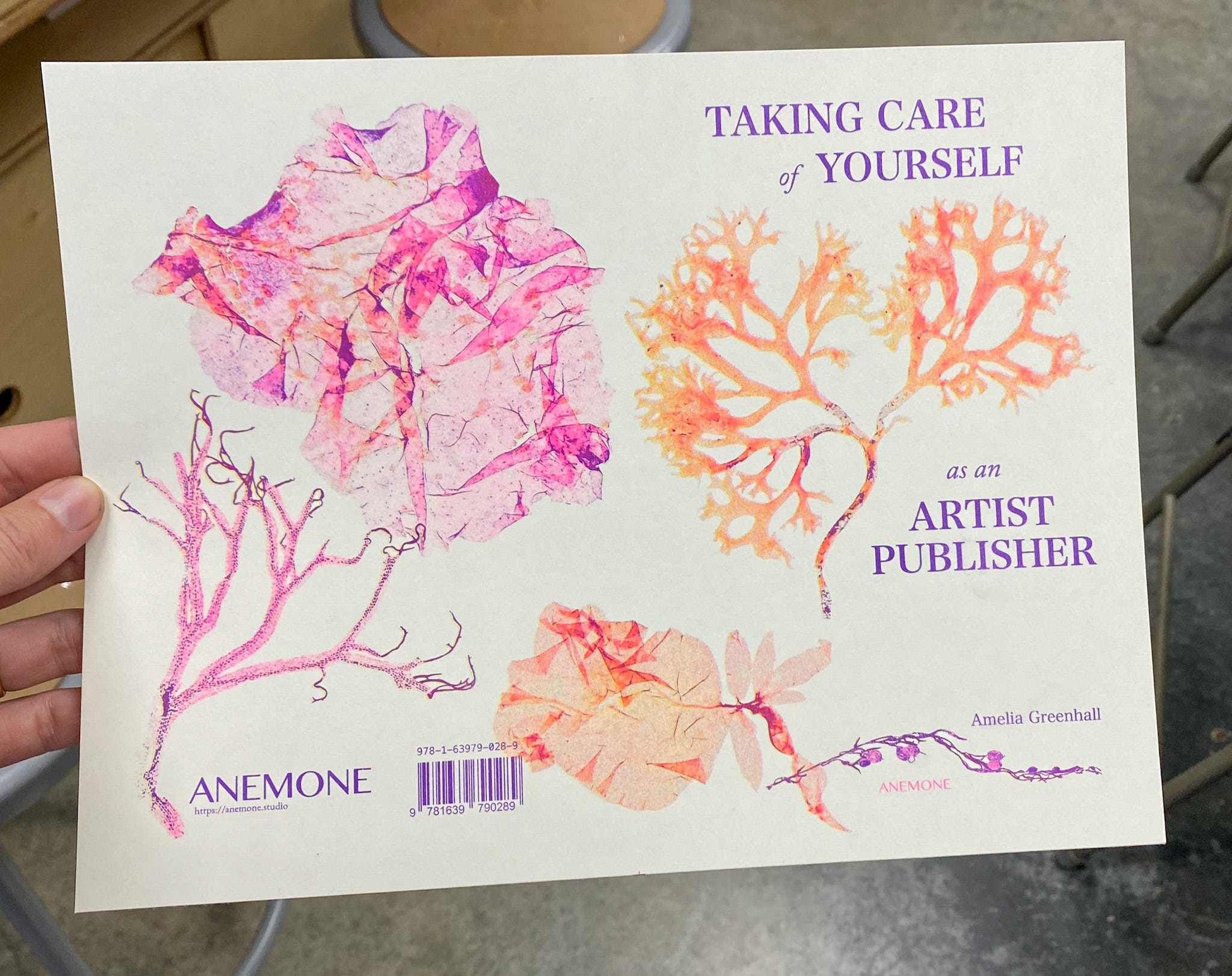
This month we printed Taking Care of Yourself as an Artist Publisher, with more scans of almost 200-year old pressed coralline algae for the cover, color edited into a pink-purple-yellow palette, resized and collaged, then separated with Spectrolite and risograph printed:
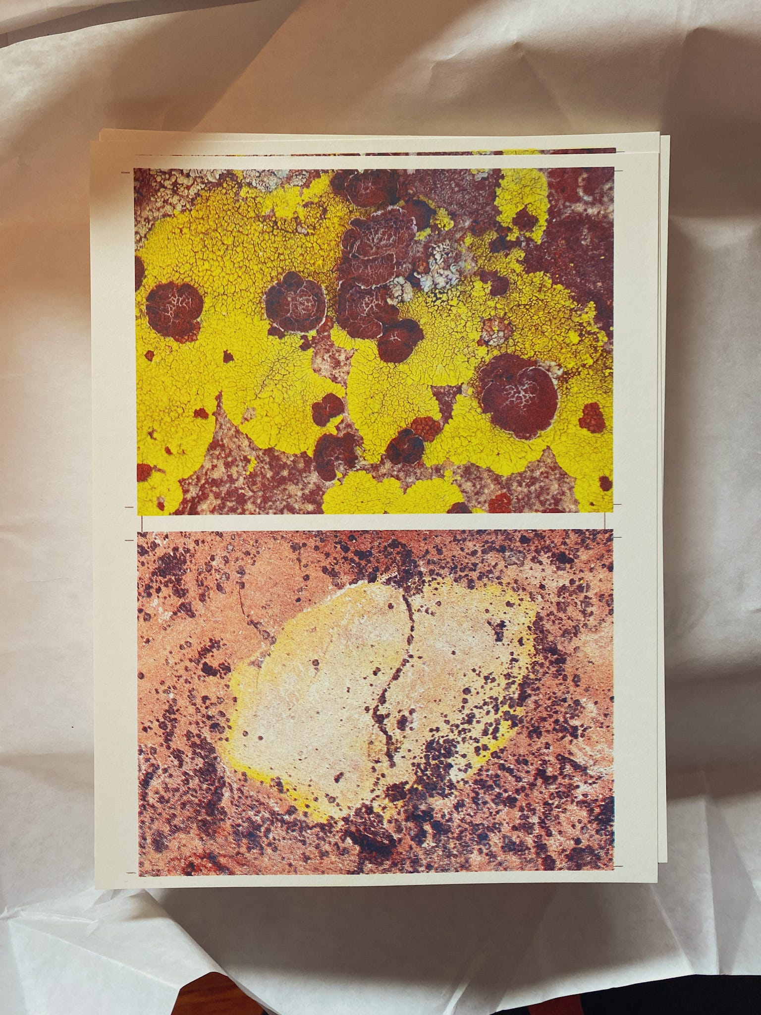
We also printed a collection of bookmarks and art prints, including these iphone camera photos of lichens from our hikes and climbs last summer.
And we have the print files ready for RISO West Coast, so that’s next on the press. Using Typst for laying out the text for both that and Taking Care was fun in a nerdy way. All these will be new for Short Run, which is November 2nd, Seattle: mark your calendars!
Also, USA based people!! Do you have a plan to vote? I Will Vote or vote.gov can help if you haven’t figured out the logistics yet.
The rest of this newsletter is about what’s new with Spectrolite, so feel free to stop here and carry on about your day if it’s not interesting to you!

There’s a new Spectrolite version out today!
I really love working on Spectrolite. Because it’s so fun to use, and so fun to design and build with Adam. It’s really cool that we are able to make a free piece of software specifically for artists and artist publishers working with risograph that’s 100% nonsensical-level specialized for such a super specific use case. Our first public release was Halloween 2020 so it’s almost Spectrolite’s 4th birthday!
Here’s what’s new today:
Dithering
Dithering creates a style of image that is pixelated into small black and white patterns. Like halftoning, it is a process for taking a grayscale image and converting it into areas of pure black and white. But instead of forming dots on regular grids, it creates small varying patterns of black and white pixels. Each black pixel is the ink at full opacity (unless you adjust it, see Opacity). Here’s an example with The Letter by Mary Cassatt:

There are many different methods of dithering, each will result in a slightly different pattern. Different configurations will also result in images with different perceptual brightness or contrast. In general, the Jarvis Judice Ninke and Atkinson methods tend to produce “finer grained” looking results. We also added options so you can also change the block size and density:


The dithering configuration that looks best will depend on your image and the visual effect that fits your artwork’s content, the size it’s printing, the style of the print/publication, and so on… there’s not one “right” answer, so experiment!
There’s also a new Color Separation section in the How-to on the website.
Trapping
Trapping is when you change your design in a very small and subtle way so that registration is easier in areas where two+ colors are next to one another. (This article has some good visual explanations.)
I first learned to do trapping for printmaking in screen printing classes in college. We did it manually in Photoshop by selecting areas of ink and expanding them, although sometimes I’d trap by using the wacom tablet to draw under the key lines on certain layers. Spectrolite does trapping automatically by checking all the areas where ink colors are next to each other, and then expanding the lighter color into (or “under”) the darker color by a few pixels. Spectrolite previously had trapping for posterized images, but now there’s Trapping for regular separations!
For example, in this design below, on the left the pink layer is directly next to the black layer so anytime the registration shifts a little, you might see a flash of the paper color that’s distracting. A good candidate for trapping!

On the right side in the Preview, it’s zoomed in to show what it looks like with 4px of trapping applied. Trapping “grows” the pink layer underneath the black layer so that even if the layers shift around a little bit on the page as they’re being printed, it’s less likely the mis-registration will be noticeable. (We also turned down the opacity of the black ink to 60% in this example, to make the trapping easier to see.)
Trapping is best for graphic work — not for photos or areas of smooth gradients — and this first version in Spectrolite is Experimental! It will work best when the original design is in the same colors that as the inks you’re going to be printing with. (Right now Spectrolite tries to make it’s best guess to match the colors, but in the future we want to make a “snap to color” style processing that’s more focused on flatter and more vibrant areas of color versus an exact match.)
You can pick between 2, 4, 6, 8px (about 0.1 to 0.35mm) or custom amount for trapping. Drag and dot the ink colors to adjust the trapping order, and choose how much “edge cleanup” Spectrolite should do to handle fuzzy edges.
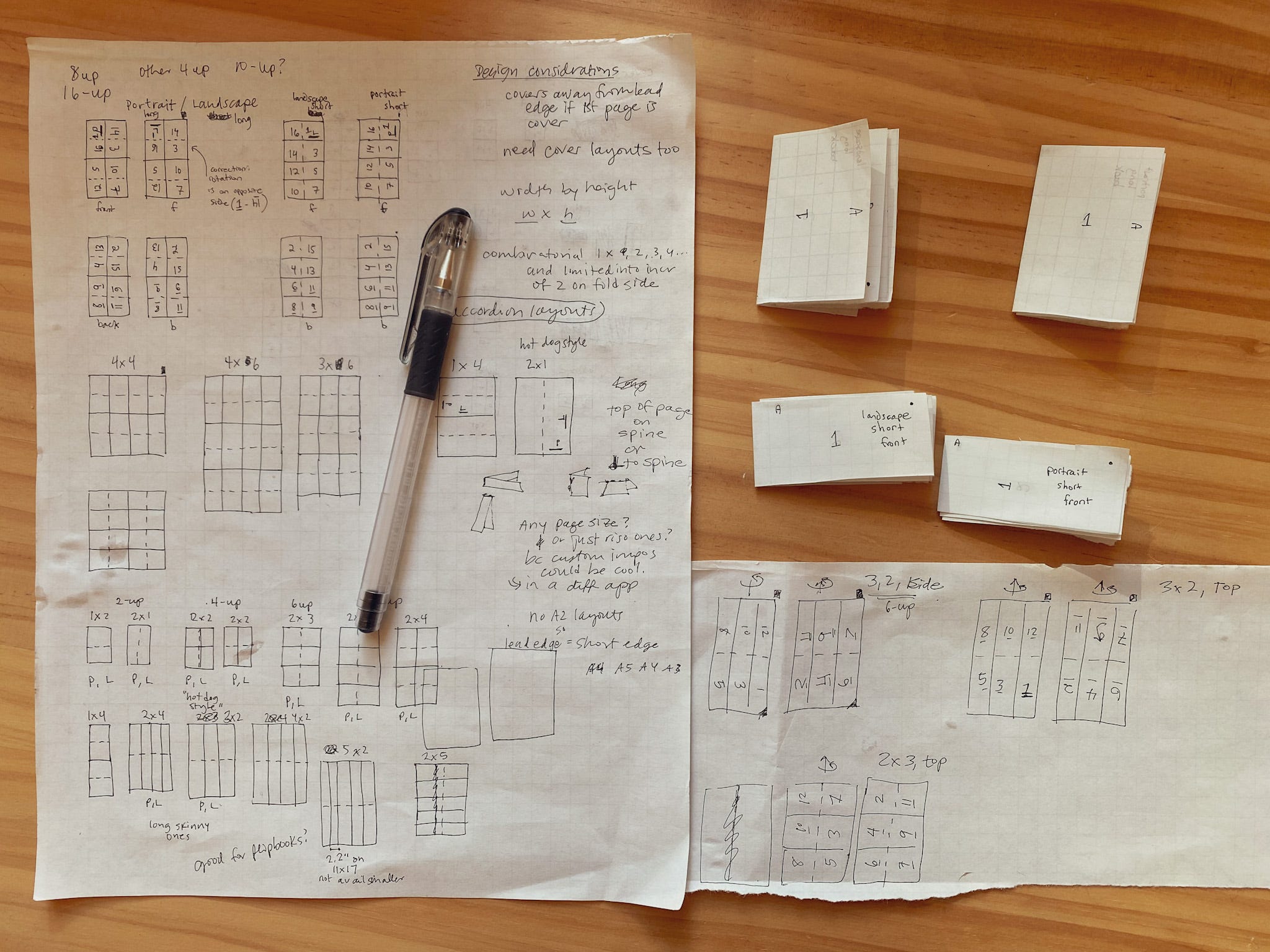
More 8-up zine orientations

We also added more 8-up options to the Layouts, so that you have all four combinations of short or long edge spine, and portrait vs landscape orientation. This works for printing onto sheet sizes A2, A3, A4 for metric, and Ledger (11x17" in), Legal (8.5 x 14 in) and Letter (8.5 x 11 in).
Here’s a little behind the scenes of developing these new imposition layouts (plus some ones that are coming later):
PSD Exports
Now you can export the color separations as channels in a PSD file. This makes it easier bring the separations from Spectrolite into Photoshop to do more edits. Sometimes you want to post-process with curves, or add or erase information, or just tweak the defaults to your liking. This could also be useful for those who working in InDesign for publication design — just embed the PSD into an InDesign project.
Big thank you George Wietor of Issue Press for helping with this!
Resize images
A small feature: now you can type in the pixels or inches/cm dimensions boxes in the inspector (on the right sidebar) and resize the exported image. The little back arrow ↺ will appear when you have made edits; just click it to reset to the original size.

This can be extra handy when you’re adding a halftone, dither, or posterize style separation, since those are so pixelated it’s good if you can make the image the exact size you want to print. (And not resize it later, because then it might get fuzzy.)
Reminder of other new things
If you missed the new stuff from last winter/spring’s releases:
Flexible sizes for PDFs into layouts! You can now add a PDF of almost any size (larger, smaller, different orientation, ...) and Spectrolite will try to fit it on the page.
Page position and sizing view for setting up zine layouts — resize your artwork, resize the margins and change the crop marks.
You can add sheet and page numbering for zine layouts, to help you be sure you’ve got the pages in the right orientation and you’re putting the correct designs on the back when you’re printing, and help make sure sheets are in the right order when collating.
HEIC images straight from iPhone can drop right into the Canvas to color separate now.
You can change the Ink Opacity for all types of separations.
As always: reminder that this is an art project so things may be wonky or weird — please send us bug reports using the form in the app (or the popup notification if an error happens) if you find anything broken, strange or unexpected!
To get the new version, open Spectrolite app and it will check for updates automatically. Or if you already have the app open, go to Spectrolite in the top menu bar, then click “Check for Updates” and it will find it for you. And if you need to download Spectrolite for the first time, you can get it free for Mac here: spectrolite.app/download
And if you make anything cool with any of these new features and want to show us, send it our way! We love to see how people are using Spectrolite as part of their projects.
—Amelia (& Adam)
